WORK
CONTACT

Moodboard / Inspiration board
the STORY
the REASON
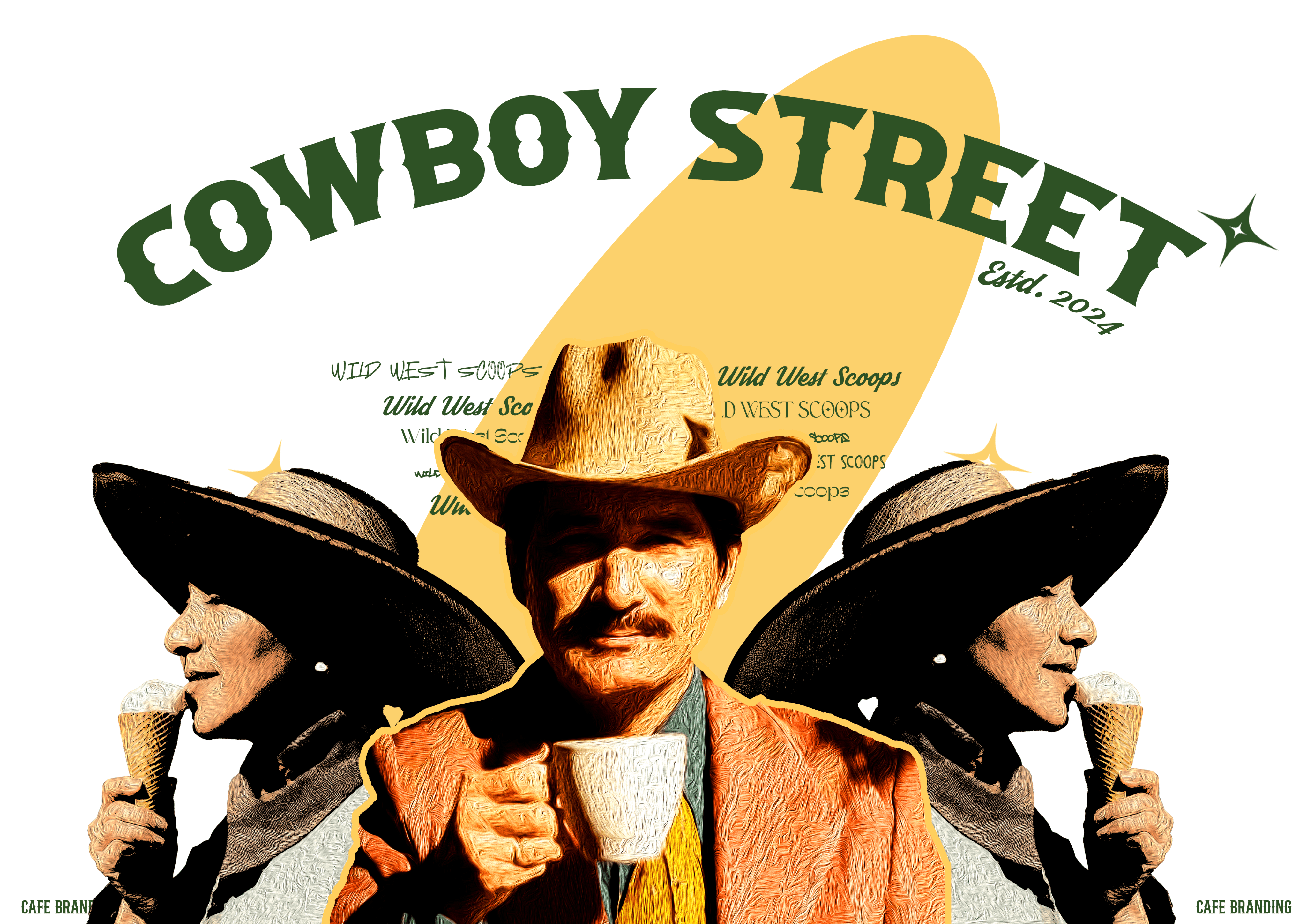
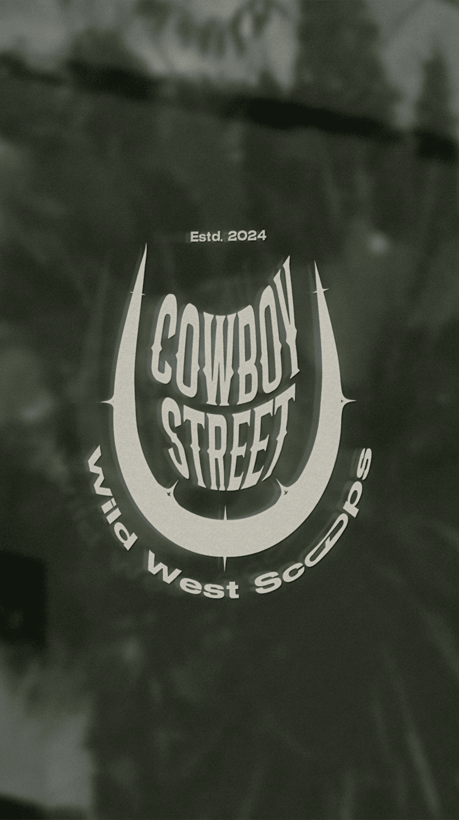
Word is on the street, “cowboy street” is in town. Serving delights and flavourful scoop experiences so unique, it takes you right back to the American era of wild west.
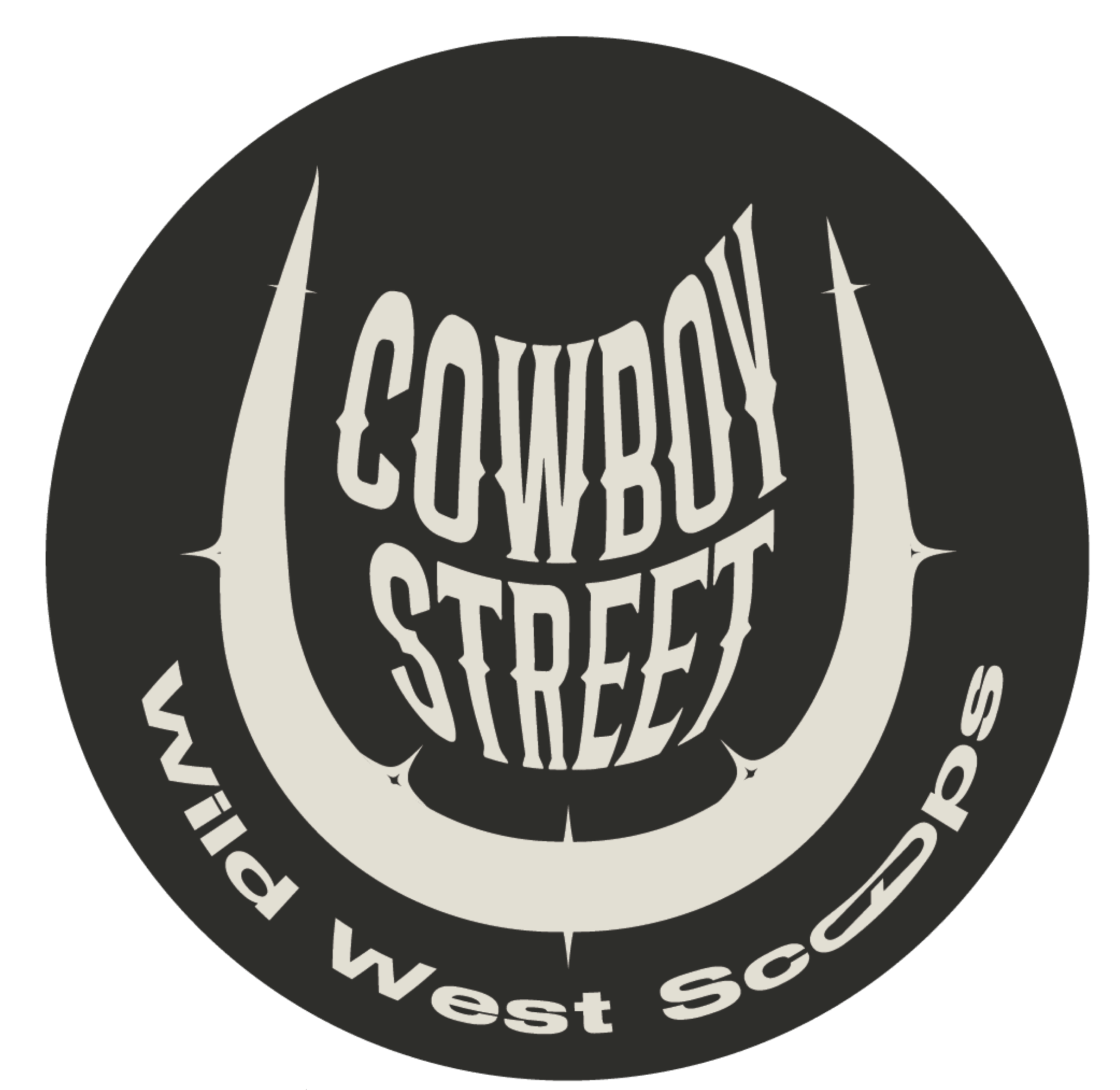
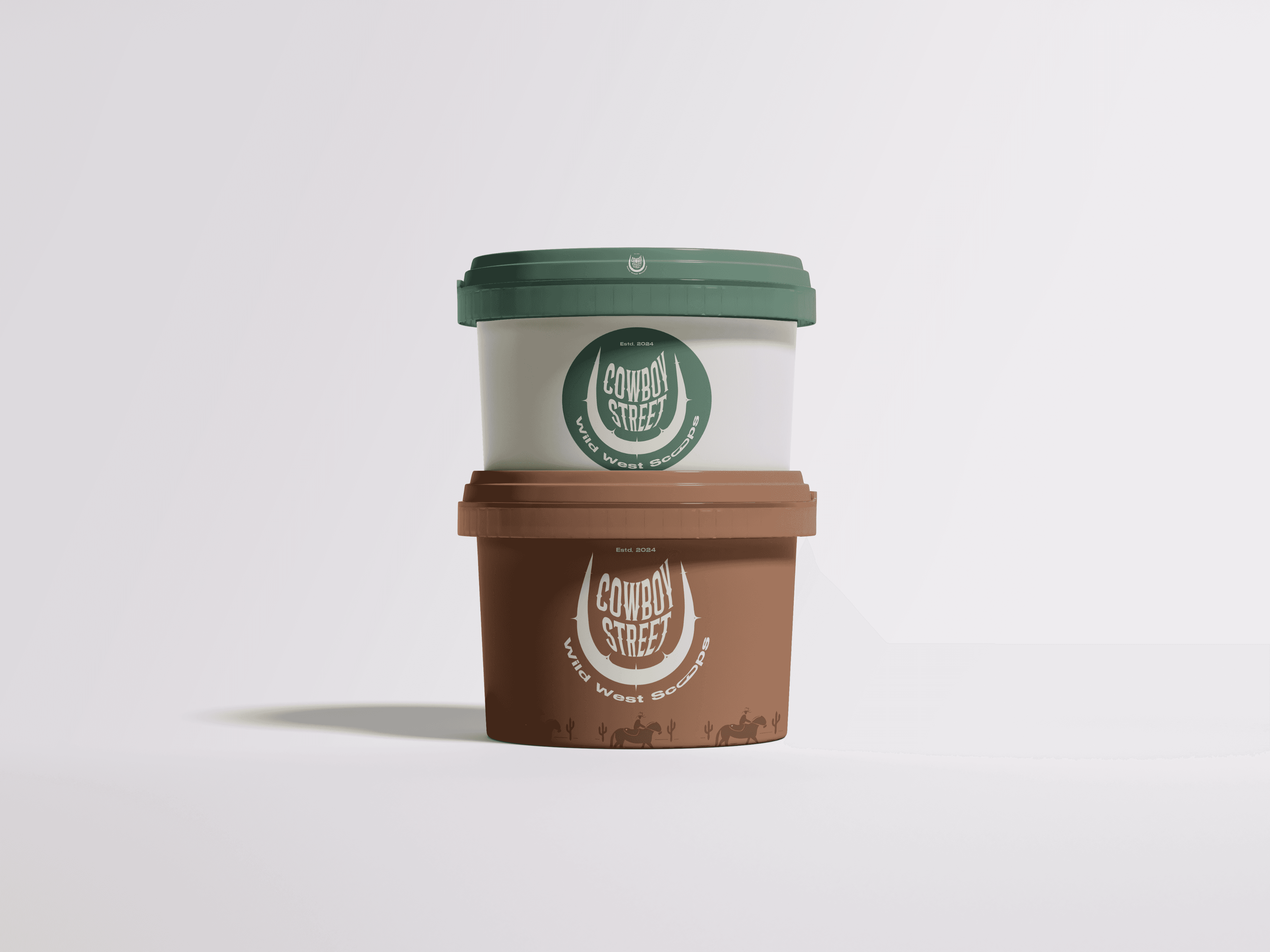
Inspired from the core elements of a cowboy palette, this logo seeks inspiration from a horse-shoe and a cactus that encompasses the name “Cowboy Street” which brings you flavour straight from the wild west. The reasons for incorporating these elements into the logo is to set forward the rustic language of cowboy street. Mix of curvy and edgy elements in the logo to casts a spell of strong brand identity.
the STORY
the REASON
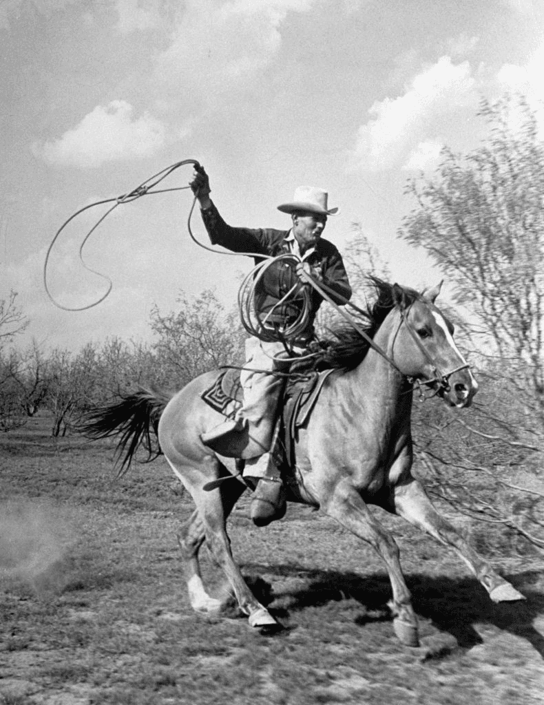
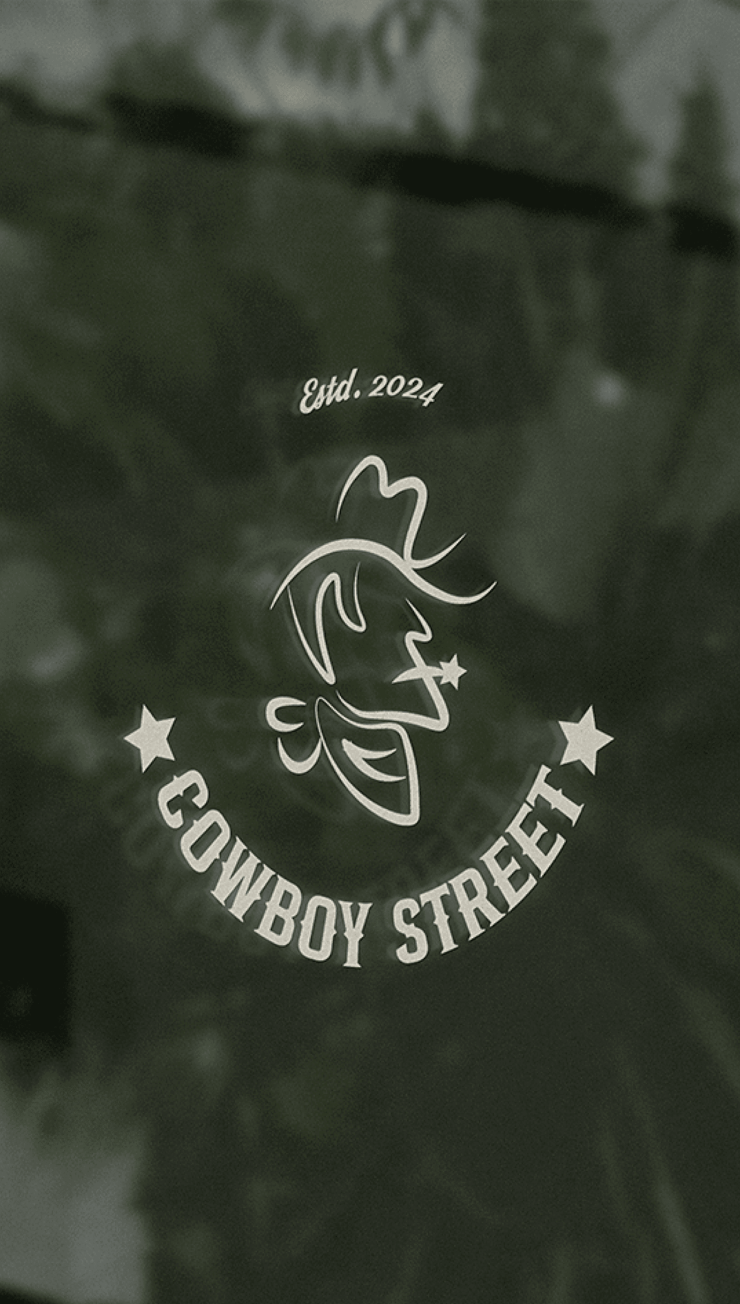
A poster from the era where cowboys ruled the west. It mentioned “Cowboy Street” which is a fresh authentic coffee cum ice-cream outlet bring to you unique flavour from the west.
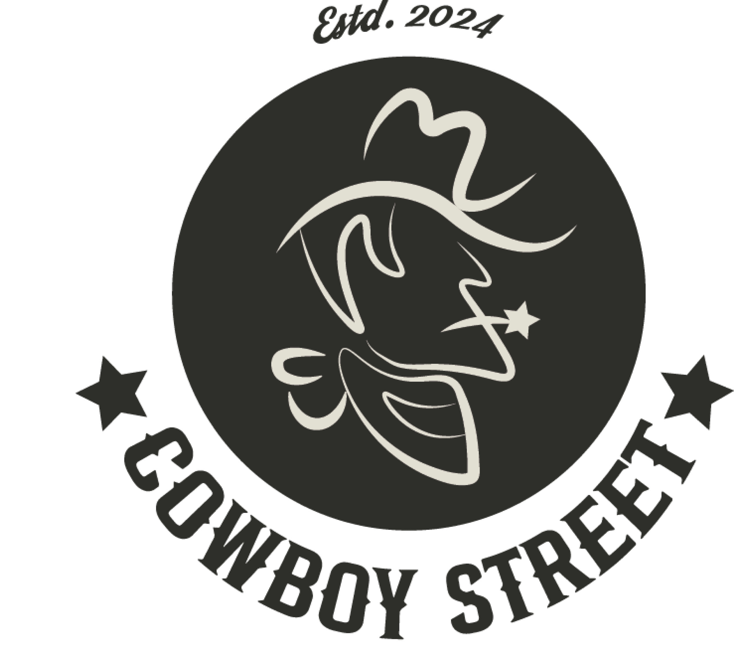
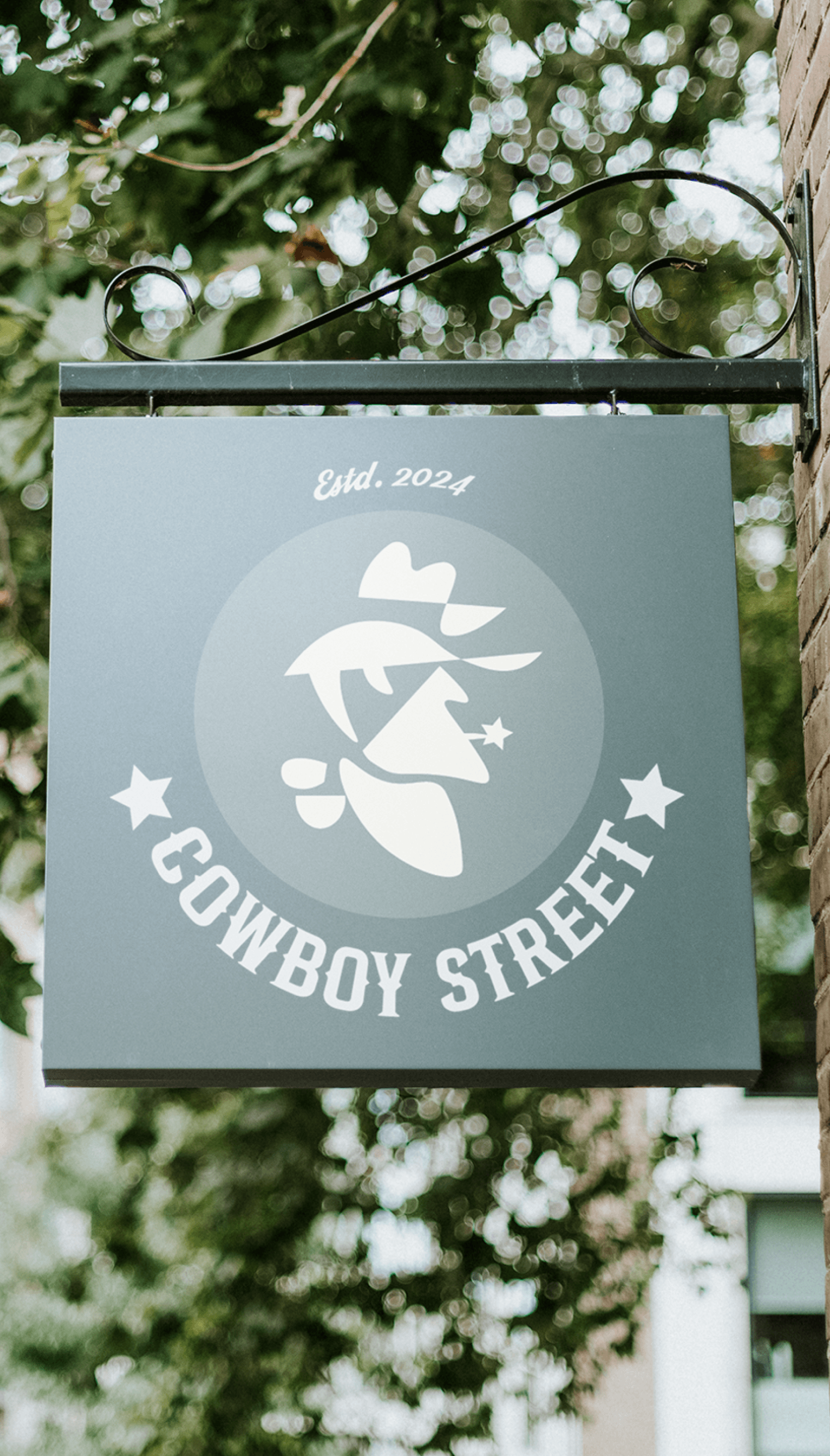
This logo showcases a cowboy’s profile, epitomizing the spirit of the American Western town with its rugged charm and timeless appeal. The bold lines convey a sense of unique impression and authenticity, making it distinctive and memorable.
the STORY
the REASON
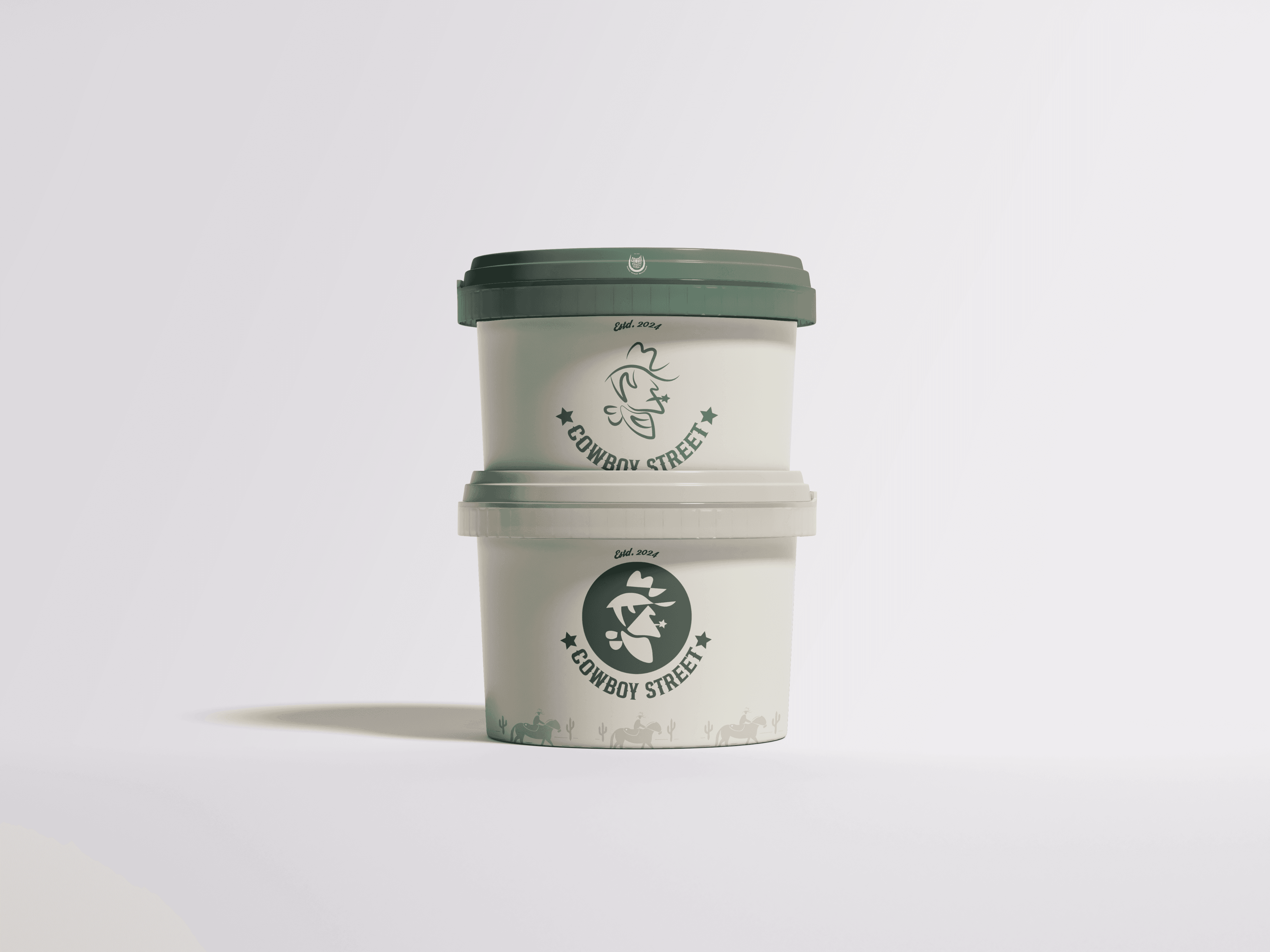
Somewhere in the wild west time a sheriff badge was discovered in the desert, it had inscription of a cactus wearing a hat. What does this badge mean? You can find out by visiting the cowboy street outlet.
Use of relatable star badge to in-still thought of the cowboy era in the customers mind. Details of cactus icon topped with a hat depicting aura of the brand that want to set a clear distinctive identity.


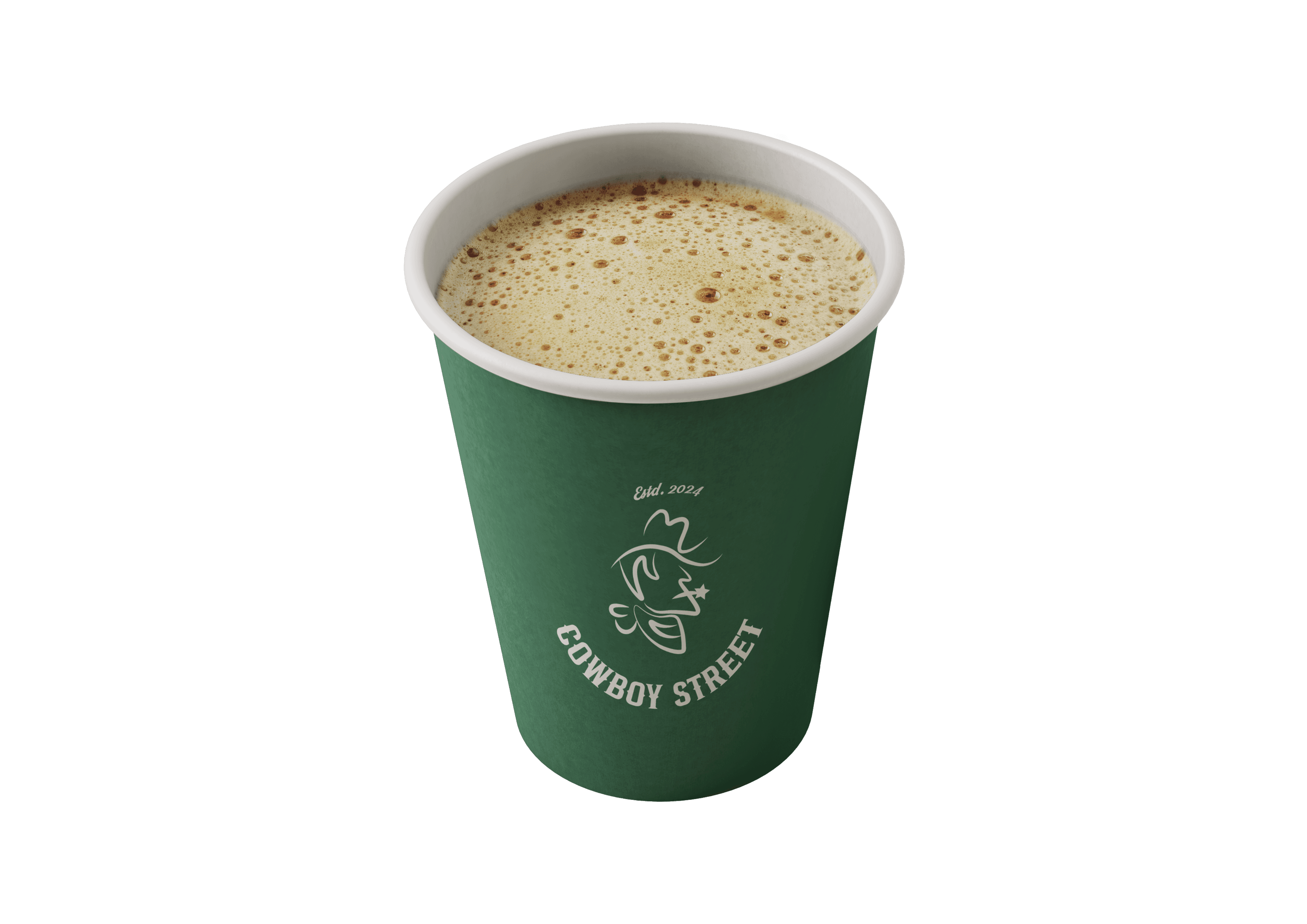
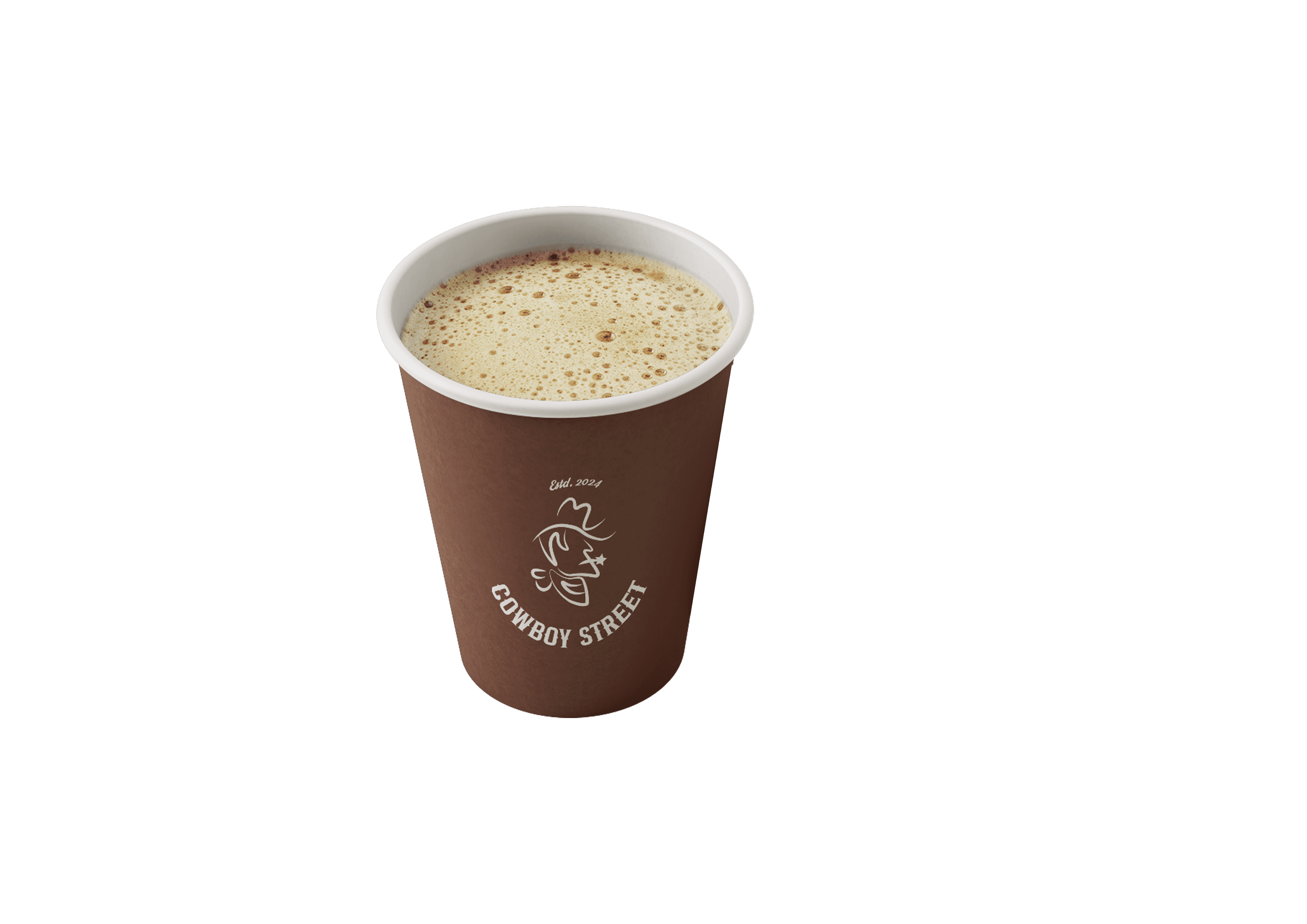

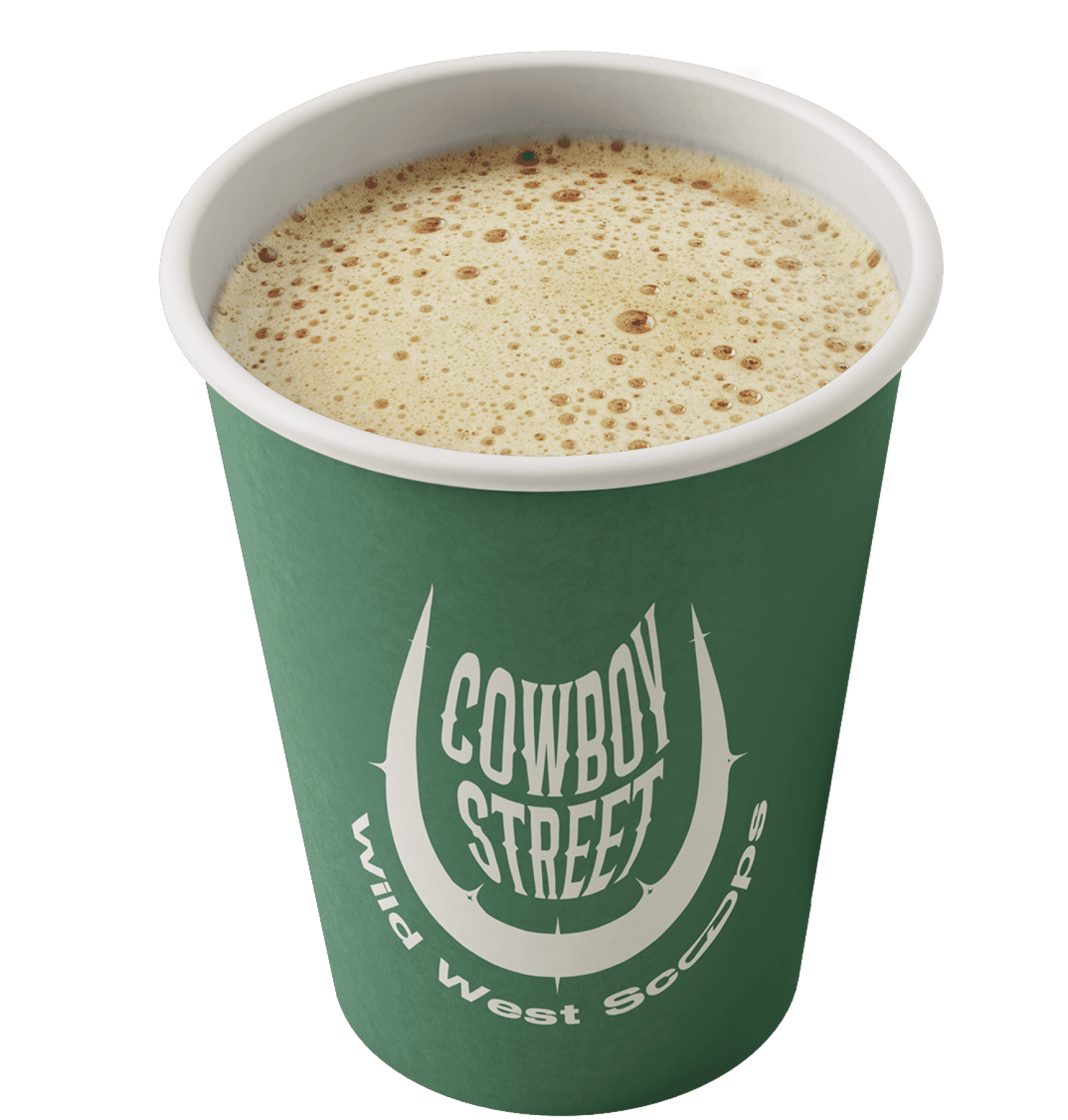
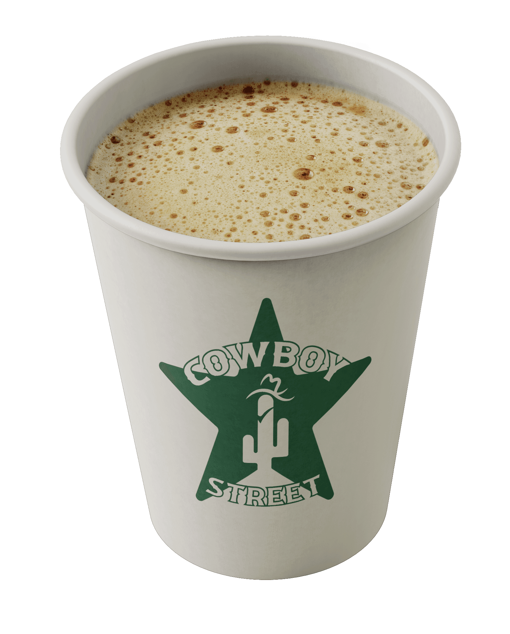
Coffee Cups Design
Ice-Cream Packaging Design
RECENT WORKS
